How do you fit a big expression on a little character?
When designing characters, a lot of people try too early to start establishing turnarounds, lineups of characters—really, the finalizing steps of the process— before exploring the character through iteration.
And one of the best ways to do that (with certain kinds of characters) is through exploring expressions.
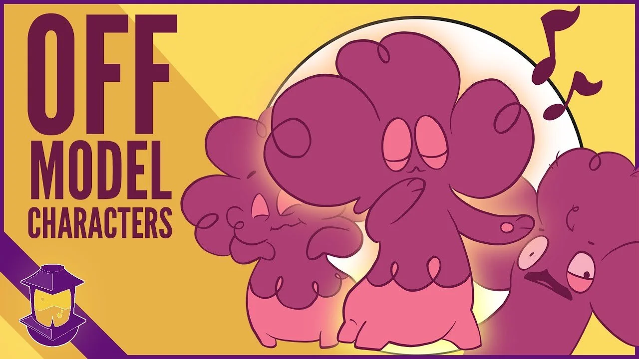
But this also causes some controversy: What's up with the complaints about characters going "Off-Model, and should you be worried?
Not only does this help you understand whether or not a character is capable of opening their mouth a certain amount, or emoting with their eyes, it can help you refine the shapes and optimize the character.
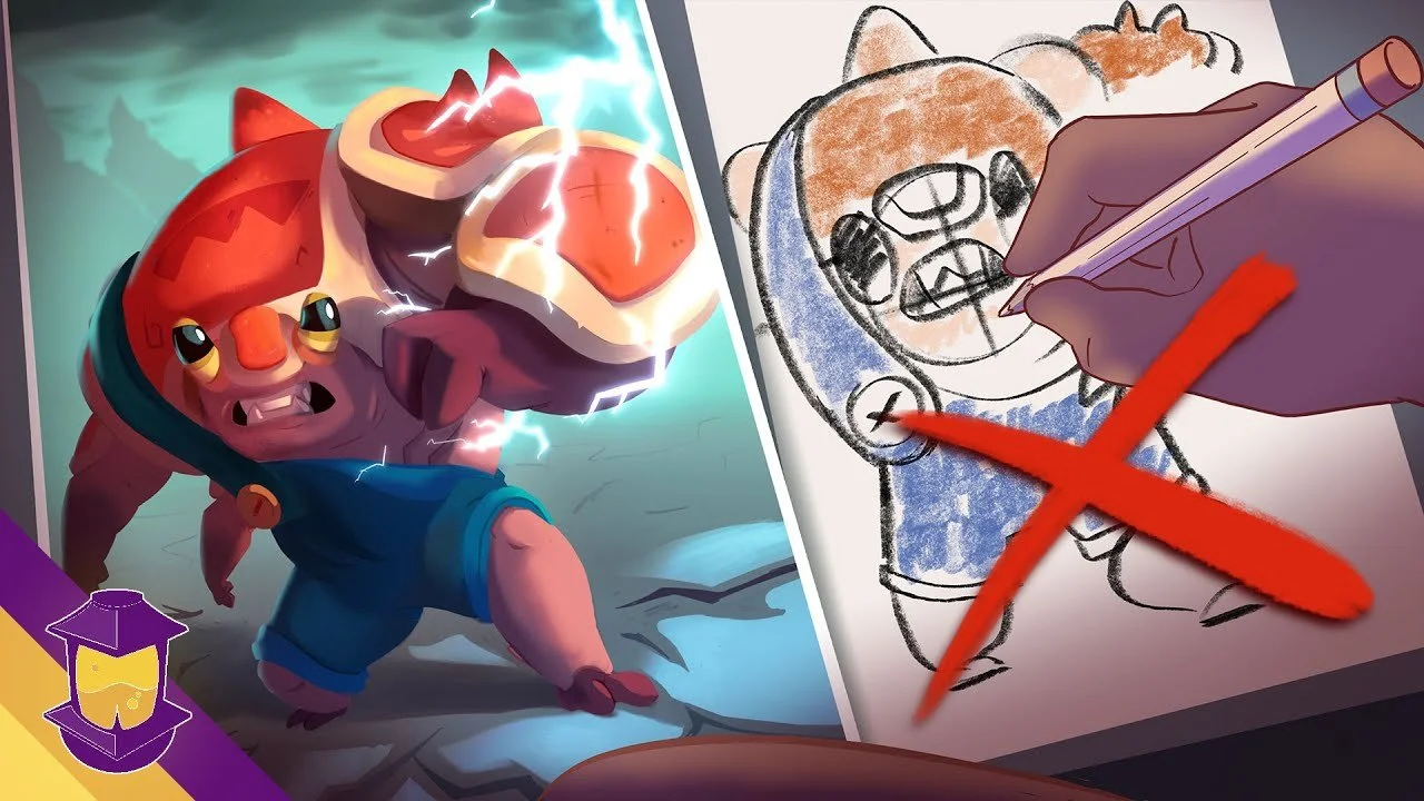
In this video we’ll take one of the caterpillar animated series designs that I sketched live during Lightbox as we talk about—well, controversy— for some reason.
Watch this video now!
Squash and Stretch, and Exaggeration
There’s two concepts in animation that often get applied to character designs simply through them working together:
1. squash and stretch
2. Exaggeration
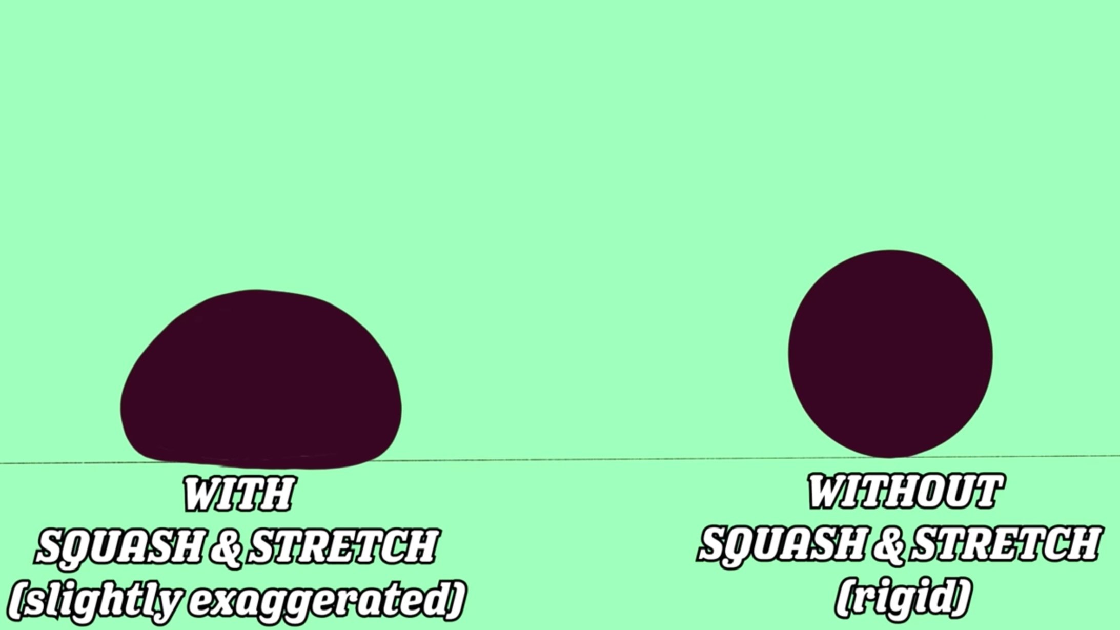
Squash and stretch is when force, energy, gravity, makes a shape malleable and changeable instead of rigid.
Exaggeration is present in practically any stylized or representative storytelling because it can help emphasize and make things larger than life— which is a lot of what animation is all about!
Some animation allows easily for squash and stretch, some of it is animated more fluidly.
Through the use of smears or exaggerated in between frames, a character like Aladdin looks livelier in motion.
You probably wouldn’t expect much squash and stretch from a more limited animation in a more rigid style, like an anime, but it still happens, and of course, exaggerated expressions are very present in that media.
The Secret Third Word: Elasticity
I’m going to submit another word to go along with these things, elasticity. This isn’t so much about the actual stretchiness of the literal character or their shapes, but about how much we easily believe big changes in their shapes because of abstraction.
This, for instance, is a real caterpillar.
This, for instance, is a “real lion”.
And this is a real “Mad Titan”
Applying any amount of squash and stretch to these characters shapes will break them literally, and breaking our suspension of disbelief that this is real and not a CGI fabrication. I’m looking at you, real caterpillar.
Aladdin, several steps removed from realism, has more elasticity.
Why? because you can have the character’s jaw stretch out as he moves, you can have features on the face move around the face slightly, and our suspension of disbelief isn’t broken.
Despite being a normal human, this stylized character is more abstract than a realistic one, so there’s more room to play with.
Now once you move into territory that isn’t even feature animation but the camp that is firmly cartoons with a capital C, you have the most elasticity.
You can have heads blow up to twice the size while a character is yelling, you can have the eyes move apart and towards each other, and we’re there for it, it doesn’t ruin anything for us, it adds to that vibe.
Want to learn how to create better, stronger expressions and poses for your own character? Check out Module 4: Pose & Expression from my course, Learn Character Design.
I am working on an animated pilot called Stormfellers which uses 3D models and hand drawn expressions, where there is some amount of elasticity but most of the animation happens with relatively rigid 3D models.
Let’s Break the Stigma of Going “Off-Model”
This Caterpillar is just one of a collective that I drew live during Lightbox this year.
The style of this caterpillar however is closer to something like a series animation from Cartoon Network or the like— a mix of rigged 2D puppets and hand drawn animation.
This is the place where our controversy comes up.
A lot of us have started seeing a growing number of people decrying animation that goes “off model”.
That model in question would be something like the character sheet, or standard look of a character— shots, or even individual frames— where a character’s proportions are different, or their face is drawn in a funny way.
What’s the motive behind this criticism?
Now, some of it just bothers people, they don’t like it personally. Some of it is supposed to fit the narrative that “it makes it an inferior product” or that “the show makers are lazy”.
Considering any aspect of the tight production schedules and intensive work that goes into animation, calling it “lazy” would be like saying a marathon runner is lazy for wearing nice shoes, or, “not going faster”.
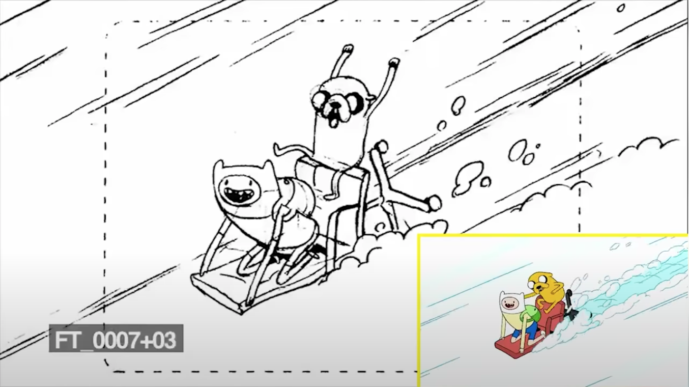
To maybe help give some perspective with an insight on the process, a lot of shows are being drawn quickly by storyboard artists first. Instead of making the final animation, they are simply making a rough draft of what the show will eventually look like.
Board artists have a very tight and economical style, really as long as the action is clear, a board artist has done their job.
A lot of times, boarders give exaggerated expressions to characters, characters who aren’t remotely drawn “on model”.
This is a strength and not at all a detractor. It leads to those larger-than-life, hilarious expressions that get merged with a final drawing later in the production process.
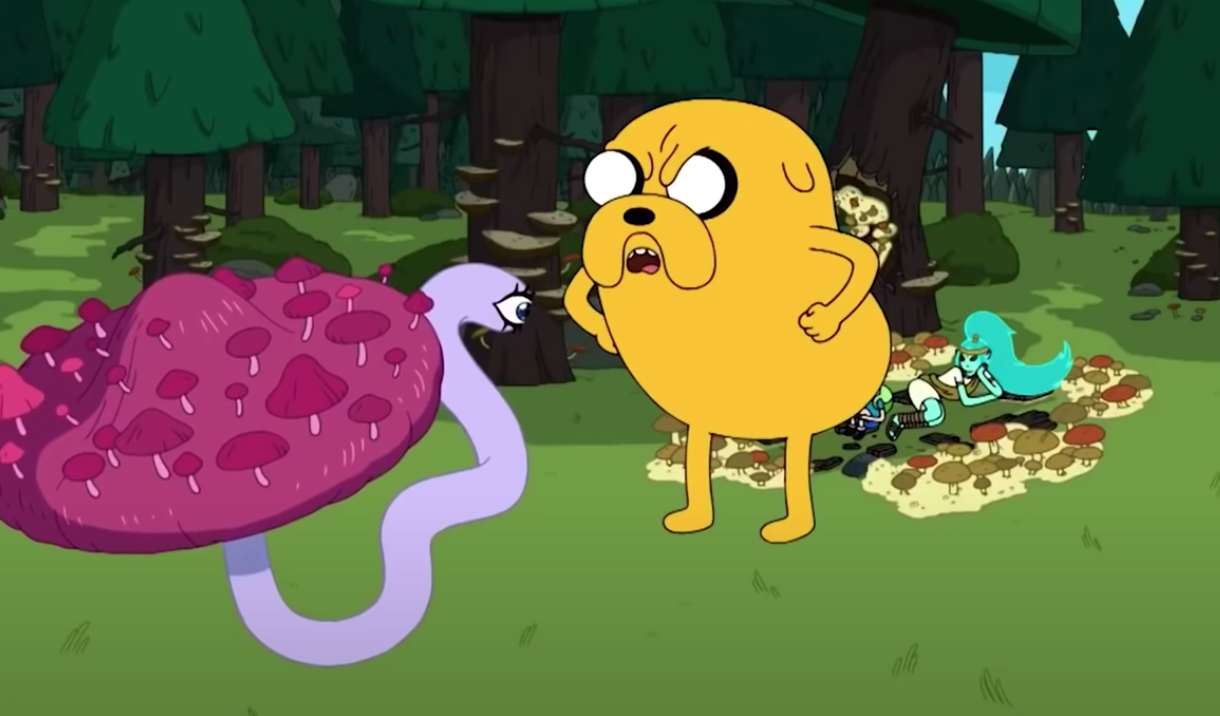
Speaking of elasticity in a more literal term, Adventure Time was an almost exclusively hand-drawn production, which meant that stylistic differences exist between the way one board artist draws a character from another.
This can be seen in the way that Jake the Dog, a literal stretchy dog in terms of elasticity, will look slightly different and from season to season depending on who’s drawing him, and of course, on the actual shapes he’s making.
To me, this serves to strengthen the storytelling. The character can serve a different role and have a look that reinforces that role in a given story. Is Jake supremely lazy today? Is he just vibin’? Is he a serene mentor to Finn? Is he experiencing some kind of epiphany or deep change? Is he just a big goof or the main character of an episode? It can all change.
Speaking of in-between frames and smears, some folks will pause and capture these frames and make fun of them, as though this isn’t exactly what a frame needed to look like to serve a richer, livelier animation.
Need help learning how to render your own digital characters? I have a whole video lesson on that! Check out Module 6: Rendering from the Learn Character Design course.
Here’s just a tiny test for you- I like to joke with friends that pausing my face at any point in a video, which is live-action, gives you a really dumb-looking face. The reason is, I’m not posing like a model for an ad, I’m talking and emoting on a video. But the individual frames look really goofy.
Film yourself on your camera and pause at any point, you’ll probably get the same experience. That’s what’s happening with animation. Its primary purpose isn’t to be paused, it’s to be looked at in a sequence.
Let’s Test the “Squash and Stretch” Technique with my CaterpillarDesign
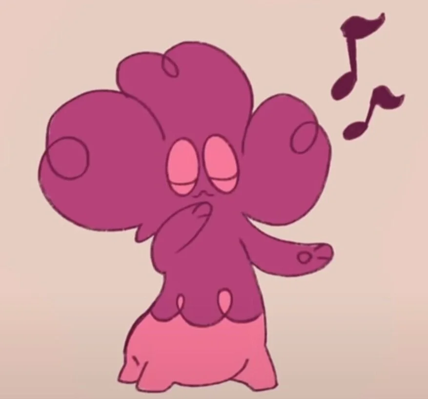
Let’s test out some of this squash and stretch with our caterpillar. We could turn his head by simply drawing these keyframes, where the face turns in one direction, or in the middle, we could add an arcing overshoot motion, which is much more lively and interesting.
Because our caterpillar is so abstract compared to the real thing, we get away with a ton of elasticity, and we get a character who can emote and do goofy things without us going “that’s weird, its eyes just got bigger”.
This is directly related to how abstract our character is.
Huckleberry Hound and Yogi in Jellystone are not literal dogs and bears.
We are okay with the shapes being representative of something, and our suspension of disbelief accepts any inconsistencies more graciously.
I won’t defend anyone that complains about something going “off-model”, but perhaps their sense of elasticity is simply different. They expect, or hold to a standard, a show like Steven Universe to maintain a level of realism that exceeds what there actually is.
Maybe they aren’t aware of the production realities that no one person is responsible for every drawing. Whatever their reason is, in your own practice, don’t let the stigma of being “off-model” force you to be overly worried about consistency in your drawings.
There’s absolutely some nuance here, being able to redraw something consistently comes with a certain level of drawing understanding and experience.
The more realism your drawing is representing, the less wiggle room you have for this exaggeration. All that being said, some really appealing and engaging work comes from using these principles in your art.
And as we’ve been showing with our caterpillar, it starts in the design process. I personally like to create characters that are simpler and more elastic to allow for this amount of squash and stretch and exaggeration.
Think about the PURPOSE (which we talk about constantly) of your character when designing.
If it’s going to move and act or emote, like a comic or animation, design for movement and emotion. Build that wiggle room in, the same way that a puppet builder BUILDS in a functional mouth or set of eyebrows.
All of our exploration of how far we could push the shapes through expressions at the beginning, and refining those shapes, lead to a character that served the purpose better.
I hope this review has helped you feel more confident with designing characters that go “off-model” and the benefits it can bring to your design process.
Do you already enjoy drawing characters with greater expressions? Let me know your process in the comments section, I’d love to hear about it!
Do you Want to Master your Digital Art and Character Design Skills?
Take the online course that has helped countless students master basic and advanced character design techniques.
Available Now!
Welcome to the Forge!
If you’re new here, get to know our mission here at Character Design Forge and start designing your best characters yet.
